JOURNEY "UNLEASHING CREATIVITY" OF VAN•HOA
- thaopham2304
- Oct 11, 2022
- 4 min read
Updated: Oct 14, 2022
Work category:
Event identity design
Social media application design
Design application experiences in space
Design printing applications
Event application design
“Unleashing Creativity” is the largest series of cultural and artistic events in 2021, organized by the Hanoi Department of Culture and Sports and Architecture Magazine, under the authorization of the Hanoi People's Committee and the Vietnam Association of Architects, in collaboration with the UNESCO office in Vietnam and the People's Committee of Hoan Kiem District.
The "Unleashing Creativity" Week is an event to honor artistic and creative projects from more than 50 professional and semi-professional artists, introduce to the public new art forms, and showcase presents the results of many creative space design competitions that have attracted young people throughout 2021. This is also the first series of events to open a creative cultural space up to 1,800 square meters in the middle of the old and new town. restored (later known as the Arts & Culture Center) at 22 Hang Buom.

VAN•HOA is honored to be the unit selected and authorized to design the entire brand identity system for the event, with applications in space, print, social media and many other categories. section to optimize the audience's experience here.
Below, VAN•HOA would like to reveal to you the creative process to develop the brand identity of the "Unleashing Creativity Week 2021" that VAN•HOA has implemented.
Research & Brainstorm - Solid foundation
In this early stage, we collected information from our partners as well as doing a lot of field research to get basic information about space. From there, consider the application of printing in practice and find outstanding ideas that express the meaning of the words "Creativity" and "Unleashing". Step by step, we have developed early plans for applications that can be developed for different exhibition spaces and events within the framework of the week.
Going back to the early days, when our Design team started to learn about the events that will take place at the Week and define the keywords shown in the project name “Creativity”, "Unleashing". To complete this project, we had the opportunity to do fieldwork regularly, accompanied by curator Nguyen The Son and art director Nguyen Duc Phuong (also known as Phuong Gio), who helped us broaden our perspective and understand more about art forms; as well as understand the message that the Organizing Committee and the group of artists want to send to the masses.
After many days of in-depth research and discussions with artists, the reference background for the design of the identity was selected according to the contemporary calligraphy art style of artist Thien Phong - also a point of view. click in Week. At the same time, the main color palette of the identity is also developed in harmony with the hydrolyzed soil color system of many regions by artist Nguyen Duc Phuong himself. Complementing the main board are tones inspired by apricot ceramics – a decorative style used throughout the architectural space of 22 Hang Buom block.
Concept Direction - Incubating ideas
After agreeing upon the style orientation, VAN•HOA embarked on implementing the first designs.
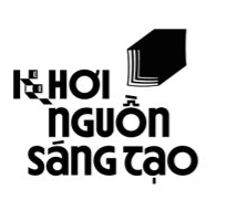
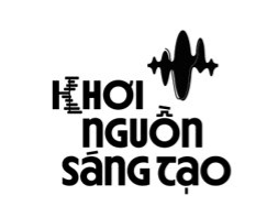
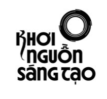
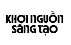
In the first version, VAN•HOA plans to develop a type-oriented identifier to further emphasize the contemporary calligraphic art element. Due to the Week's multidisciplinary events, VAN•HOA also created a coordinated symbology to enhance information flow.
However, the Organizing Committee also wants to have a clearer logo image than just words. After many discussions and discussions with friends, VAN•HOA and the Organizing Committee finally chose to develop an identity image according to the concept of “Gorprouting” – and use the image of the leaf sprouts as the language of expression. to achieve the spirit of the event “Unleashing” and “Creativity”.
“Sprouting” represents the beginning, from one idea that grows to spread and connects to other emerging ideas. To illustrate the emphasis on the "process" of germination, different from the usual green sprout image, the solution is given to use wavy lines that are close to each other, with an upward direction - show both the general movement of the image as well as create a 3D block illusion, impressing the viewer.
Final - Results from "sprouting" to "weaving silk"
Deployment across multiple versions, working to improve the product every day. The final logo has best illustrated all the ideas of VAN•HOA and the program organizers are aiming for. The identity block has a more impressive layout.
In the last drawings, the Logo is directed towards winding in the shape of the letter S (with the curved tail penned by curator Nguyen The Son) - with the desire to show the topography of Vietnam - an affirmation for Vietnamese creativity.
In the flow of development, the wavy lines that represent the growing movement of the sprouts are also associated with the artists' silk fabrics – also a main material used throughout the Week.
Implementing a brand identity for a group of brains and rich imaginations is really far from the experience for commercial brands. Instead of barriers of brand code of conduct, artists seem to seek freedom and constantly change their perspective to always find new ideas.
Finally, the brand identity is also completed, with the idea of starting from the "creative" seed being stimulated and developed, then growing up and bending with the ideas - and the development journey of the brand. The creative germ, with ideas and cultivated with artists, has become a silk thread that is interwoven and woven from the creativity of many industries, together "woven" into a budding creative industry in Viet Nam.
However, all technical designs always keep the rules of geometry and position, to ensure the signal recognition throughout the entire event. After 1 year, this identity still receives encouragement and sympathy from the Organizing Committee - to continue to conduct expansion for the 2nd year event.
--
Article written by: Khanh Ly
Edited by: Dung Pham, Chau Nguyen








Comments